Boring Notch

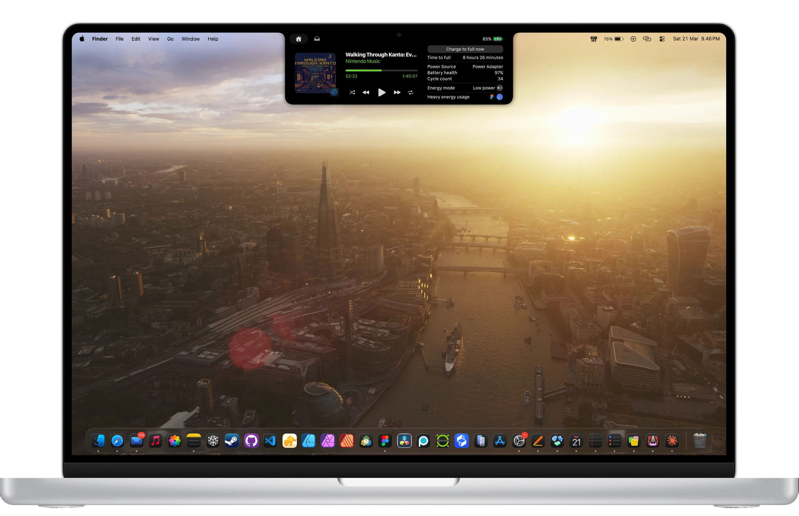
As I used Boring Notch daily, I encountered several issues that prompted me to contribute to its improvement. Two significant problems were the jarring and underdeveloped battery information space, which lacked more useful details about batteries.
PERSONAL CONTRIBUTION
OPEN-SOURCE
MACOS
VIEW PROTOTYPE
My role
Contribute to existing open-source app for MacOS.
Revamp User Interface, and User Experience on battery.
Prototyping.
Moodboard reference
MacOS Tahoe battery power source
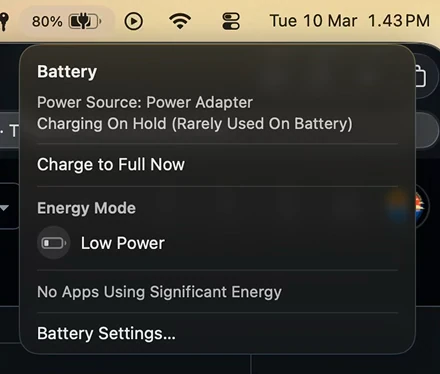
Power adapter
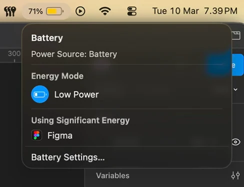
Battery
Taking reference from default MacOS Tahoe window on battery, taking their background blur & separate line.
BatFi
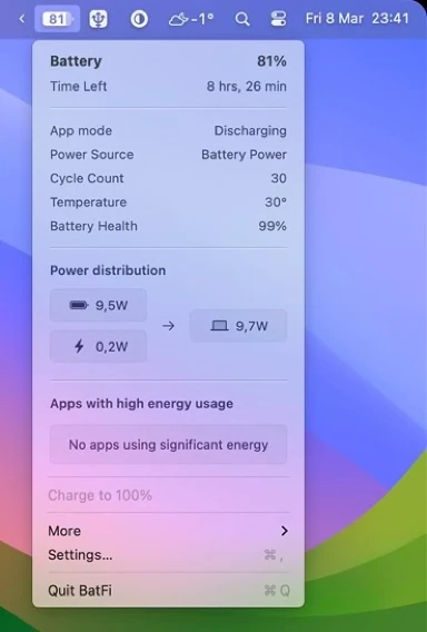
Taking reference from 3rd party BatFi app on grid system, and what information to display.
Baseline Boring Notch
Boring Notch window
Version Flying Rabbit (2.7.3)
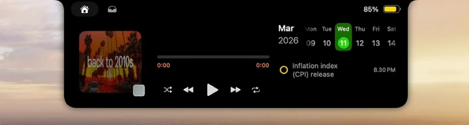
Calendar enabled
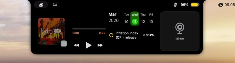
Calendar & Mirror enabled
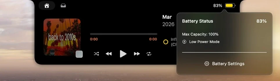
Battery window
Discovering canvas size & guide
The height & weight
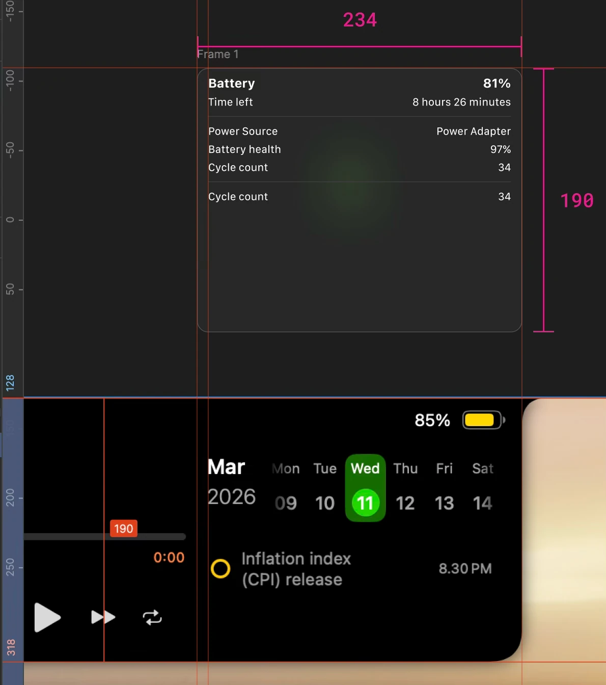
As I determine what canvas size to use to fit battery informations, I got carried away by references then stoped mid half designing battery window, realizing that accessing battery information with presenting it in a floating window breaks the seamless experience of Boring Notch.
Correction of height & weight
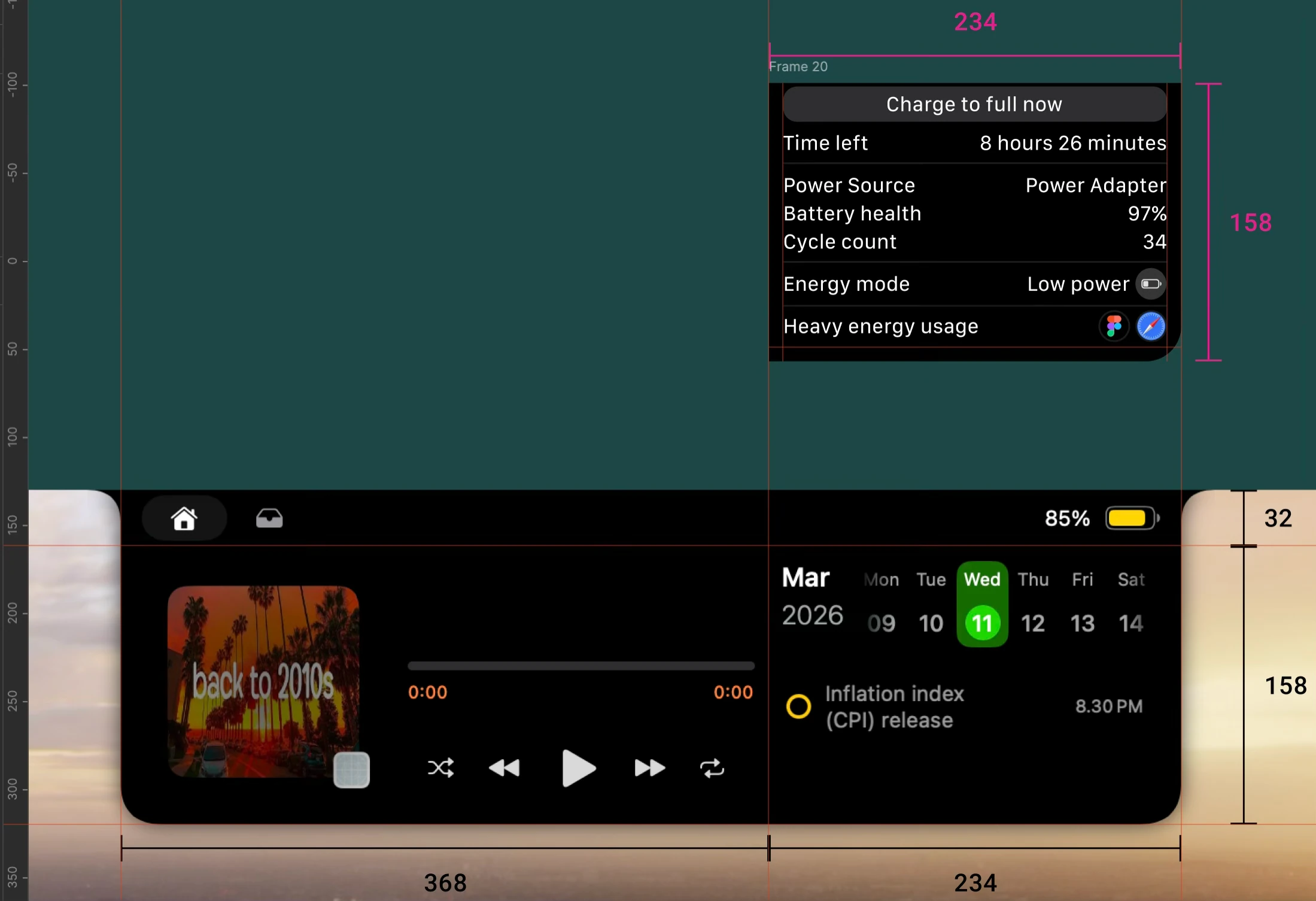
A canvas with a height of notch window are now in line, I then weighting on what information are more useful to display in the new compacted canvas compared to floating window.
The width
Regarding canvas width, it depends on the scenario.
Scenario A
Calendar is toggled on.
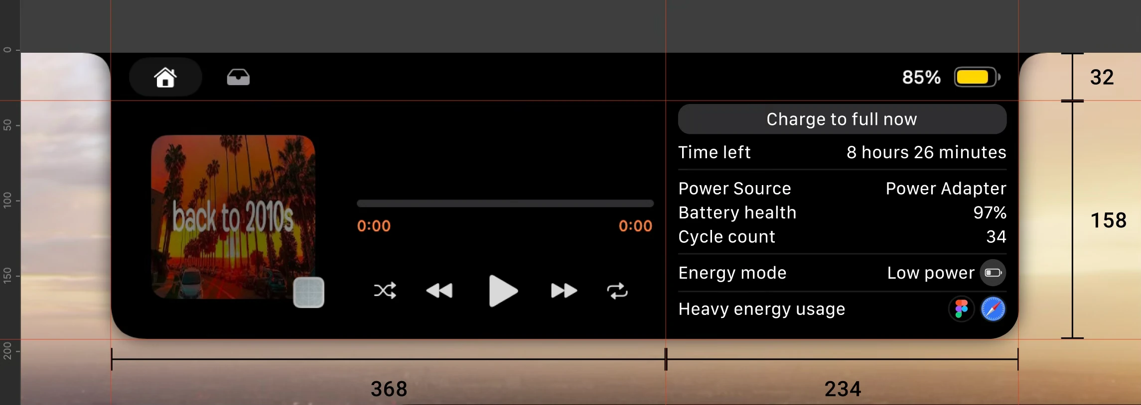
Scenario B
Calendar and boring mirror are toggled on.
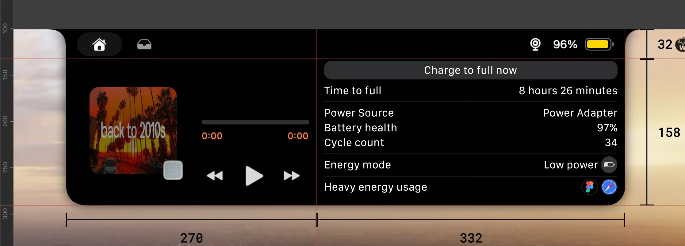
Scenario C
Neither toggled on. Same width as scenario A, only difference is the in/out animation. Animation I’m going to exhibit later on.
UI touch up
Battery padding window
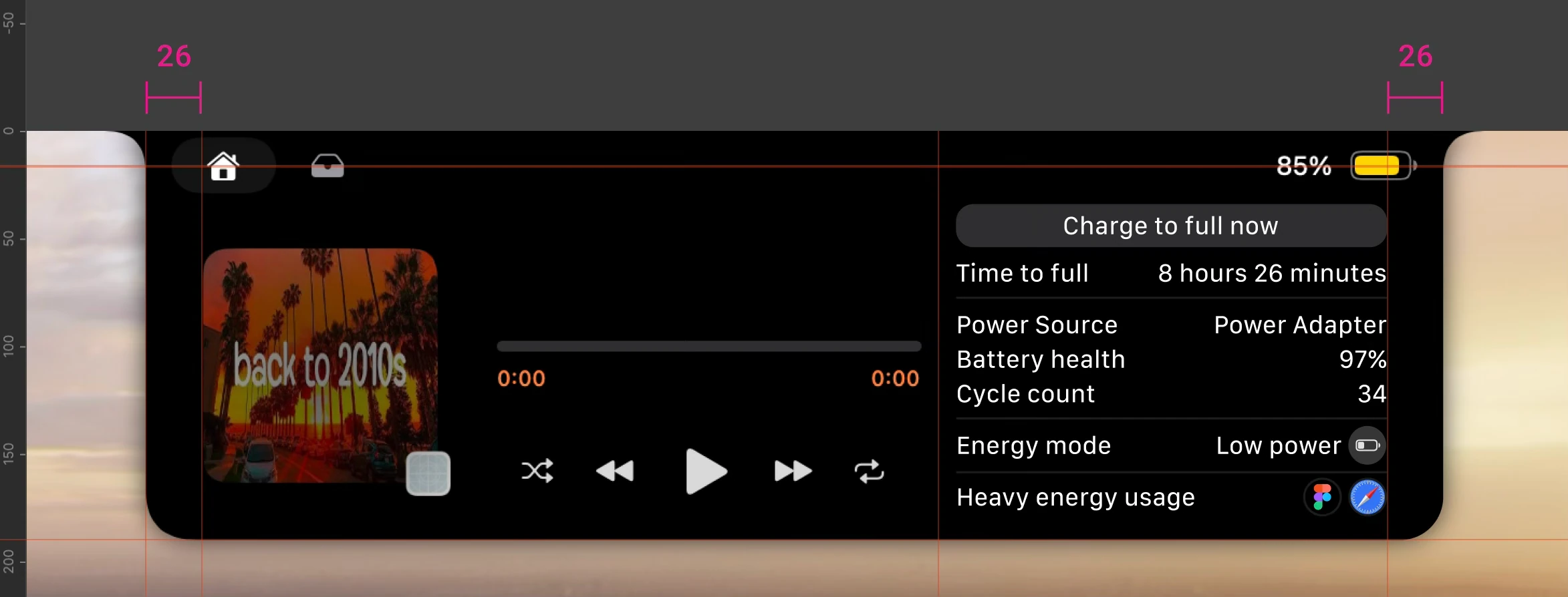
Equalize the right canvas padding with the left.
Battery resize & repositioning
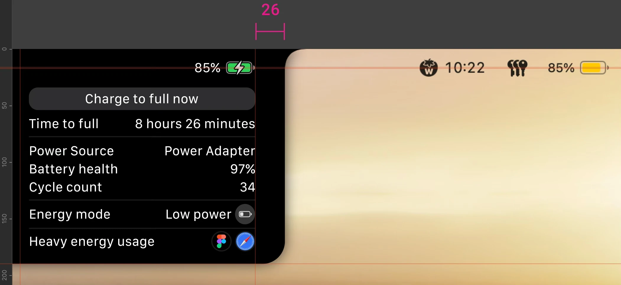
Equalize the battery to be the same size and height with battery icon on the menu bar, as well as aligning it with boring notch padding. Text shrink to match default MacOS UI.
Media stand by
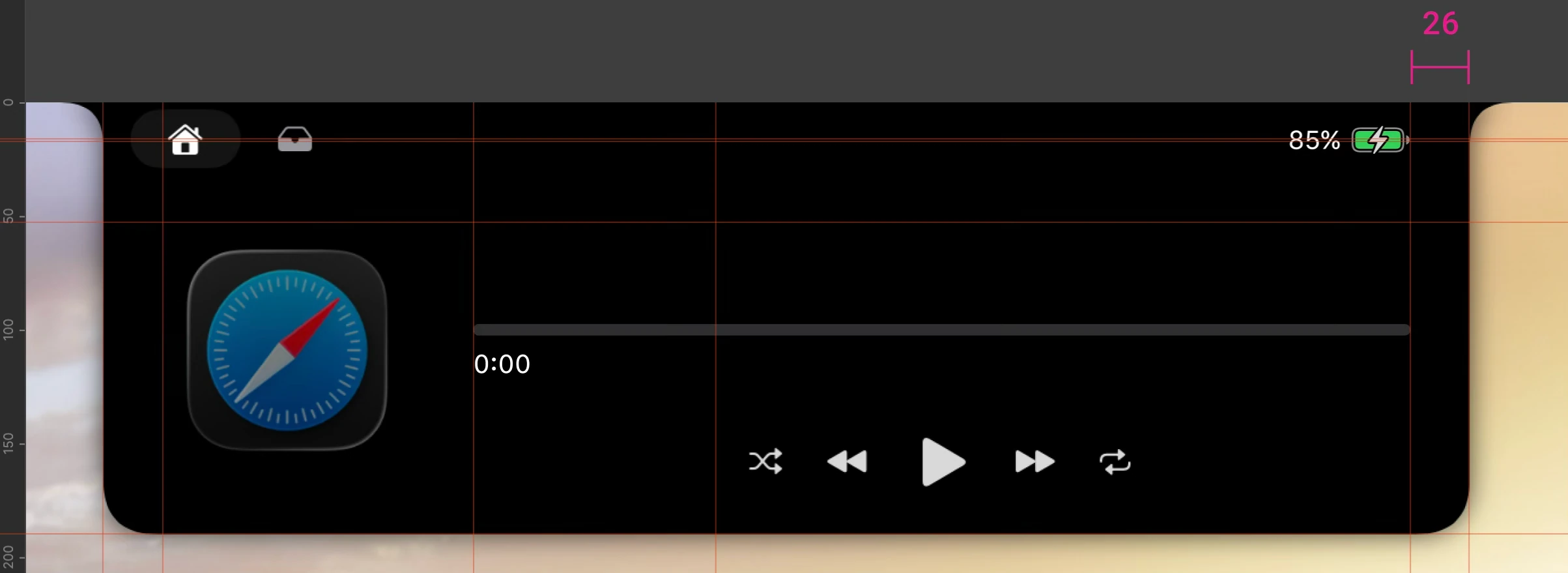
Shorten scrubber on the right to cap it with 26px padding, as well as moving media control group to be centered by scrubber. Removed total duration when stand by, that will be visible again if there is media in play.
While I do have ideas to try in media stand by by adding music library selection and so on, right now the focus is for battery information.
Thumbnail
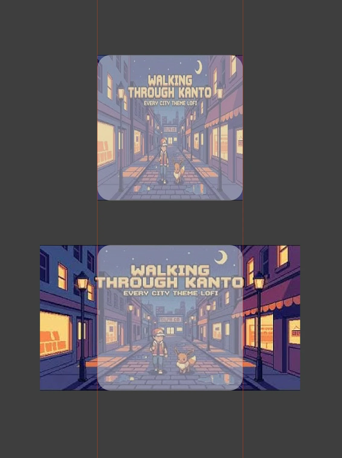
Currently thumbnail image are forced to get squeezed from ratio 16:9 to 1:1. It is unpleasant to see if the thumbnail is actually a beautiful girl with deformed potato head with this squeezification.
Therefore, clipping thumbnail is a better way to display it.
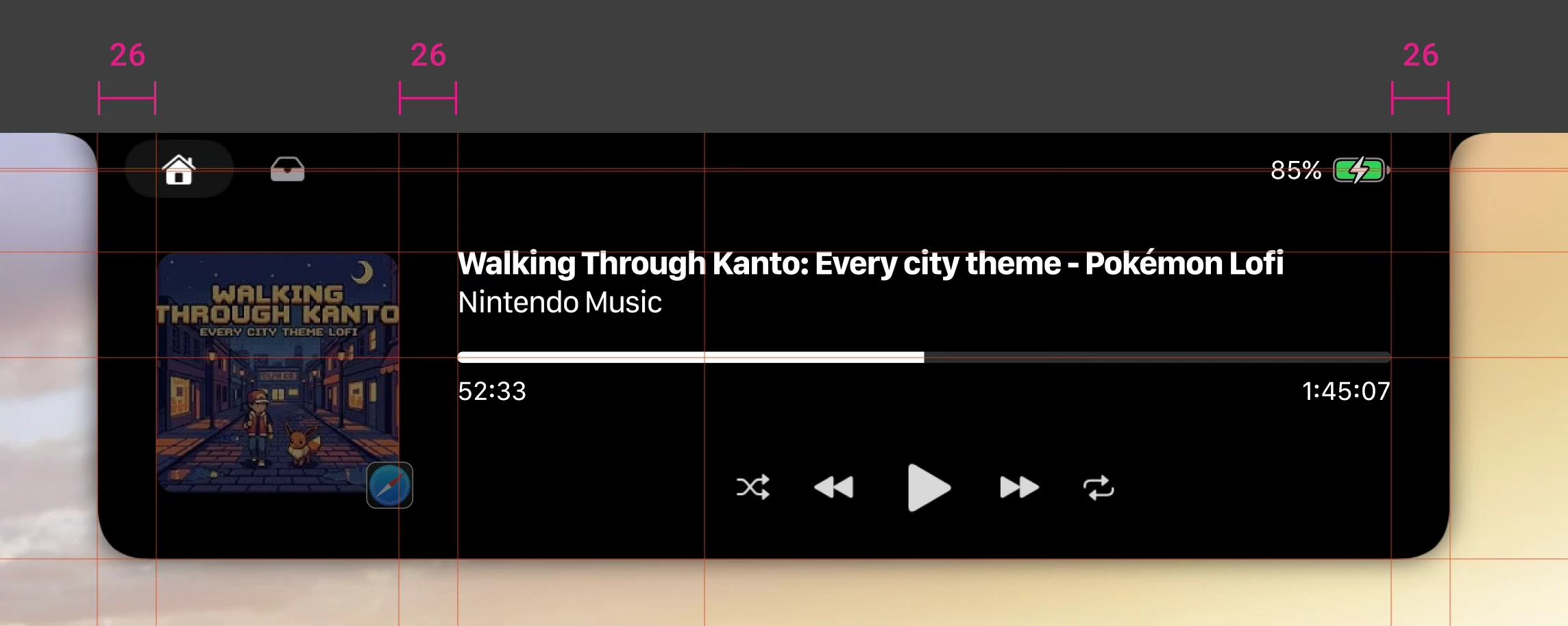
The unsqueezed thumbnail within it’s habitat on a paused media
Slightly adjust the gap between thumbnail and context area to be the same as both padding. Now if the media is played the thumbnail won’t grow, only the dim faded.
Accent color sync
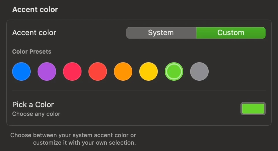
Adding some element to get influenced by accent color from setting. Right now I’m selecting lime green (#66D22D) from the palette.
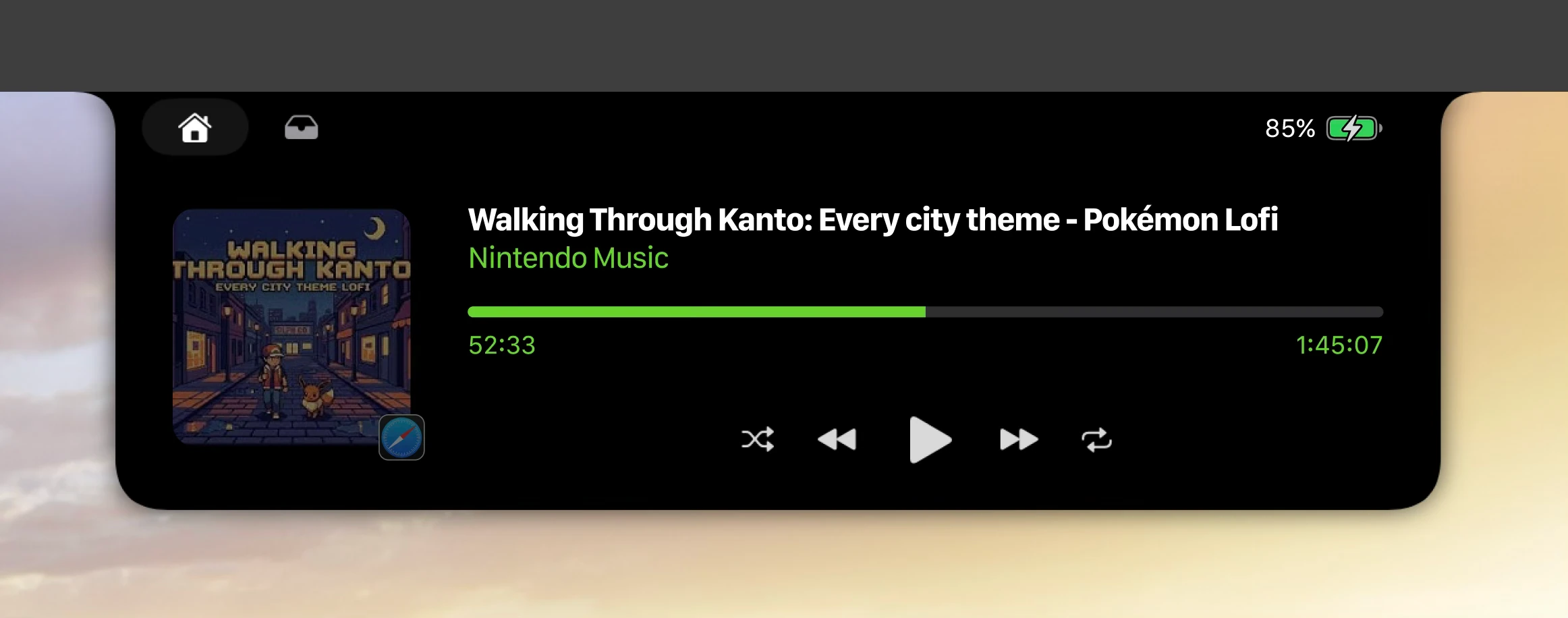
The 2nd paragraph from title, scrubber, current time, and total duration get synced with accent color.
Variations
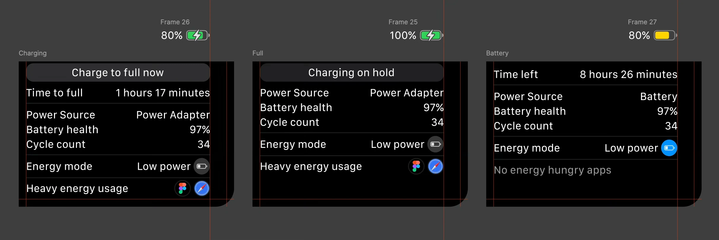
Variations are depends on 2 variable: Power source & battery percentages.
Charging
State 1
Power source is power adapter.
Battery = 80%
Has all visible, charge to full now button, to time to full.
State 2
Power source is power adapter
Battery <80%
Don’t have charge to full now button, will appear when it reach 80%. The time to full is still visible.
State 3
Power source is power adapter
Battery >80%
The charge to full now button replaced by text pause charge to full.
Full
Power source is power adapter.
Battery = 100%
Has replaced text button on charge to full now to charging on hold on read only button, and time to full gone.
Battery
Power source is battery.
Battery between 1-100%
Has replaced time to full with time left.
Animations
Scenario A
The calendar is toggled on.
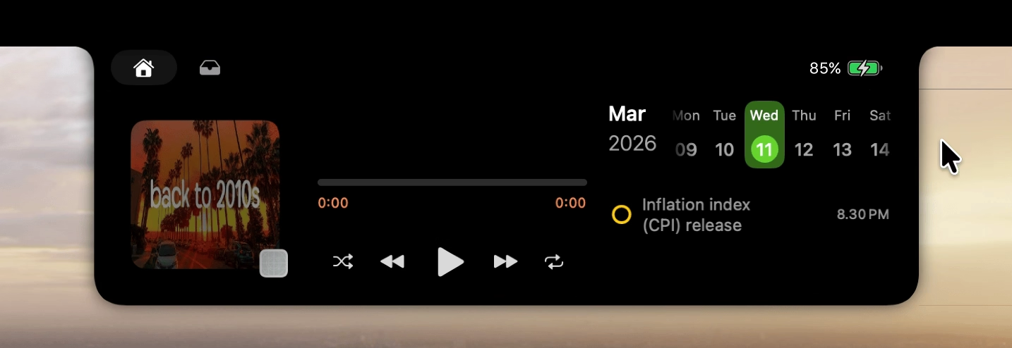
Gif file of scenario A in and out
In animation
Accessing the battery information by clicking on the battery icon as well as on the battery percentage.
Calendar size shrink by 10px on each side anchored by center, with opacity turn to 0%. While for the battery information window itself opacity background from 0% to 100%. Transition speed is fast (ease out 200ms).
Out animation
Simply cursor leave from battery information area will close the battery information.
Doing reverse of in.
Scenario B
The calendar and boring mirror are toggled on.
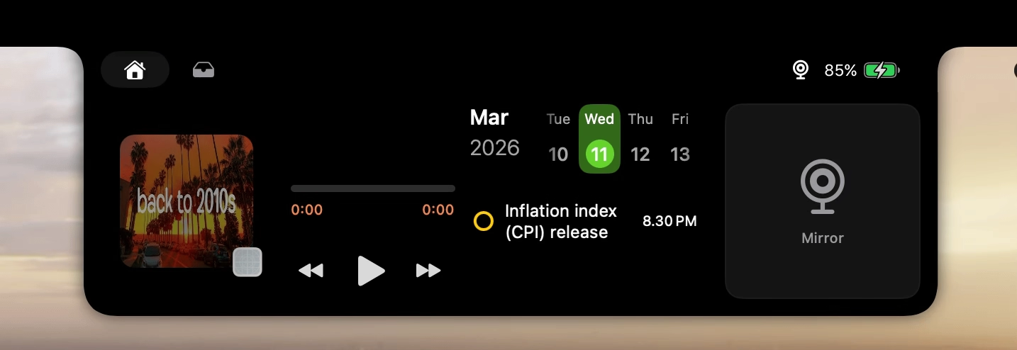
Gif file of scenario B in and out
In animation
Accessing the battery information by clicking on the battery icon as well as on the battery percentage.
Calendar and boring mirror size shrink by 10px on each side anchored by center, with opacity turn to 0%. While for the battery information window itself opacity background from 0% to 100%. Transition speed is fast (ease out 200ms).
Out animation
Simply cursor leave from battery information area will close the battery information.
Doing reverse of in.
Scenario C
Neither toggled on.
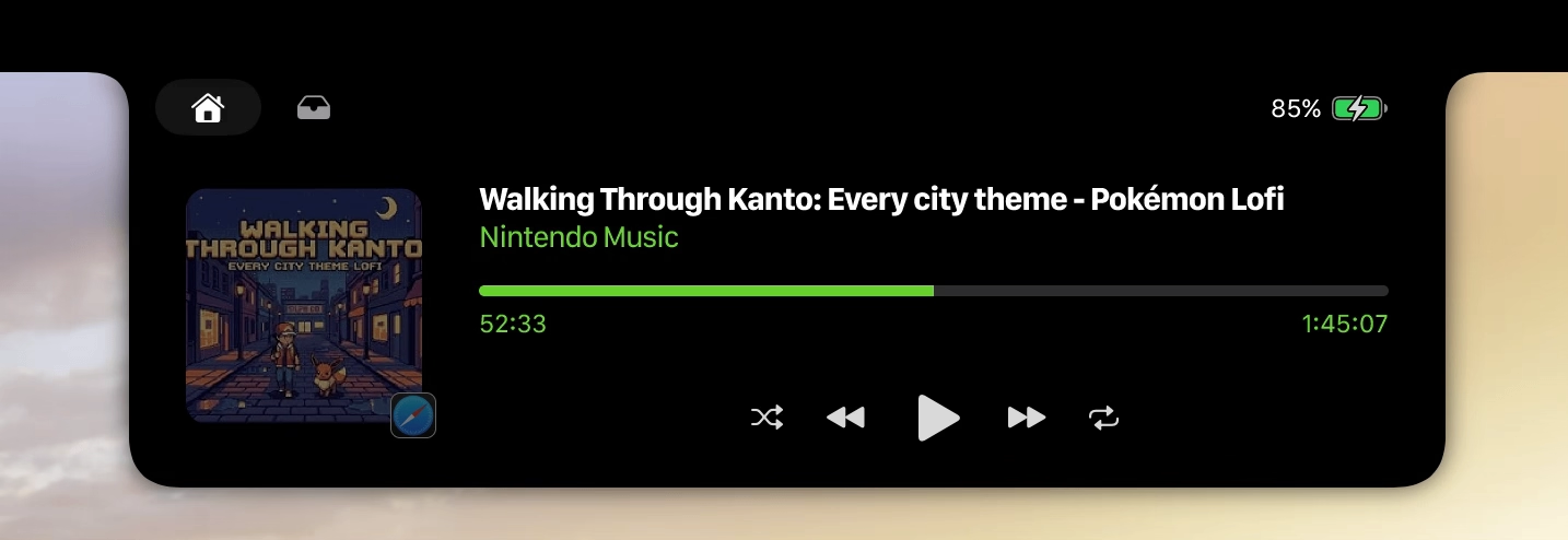
Gif file of scenario C in and out
In animation
Accessing the battery information by clicking on the battery icon as well as on the battery percentage.
For the battery information window, it comes from the right side of the Boring Notch window pushing the media.
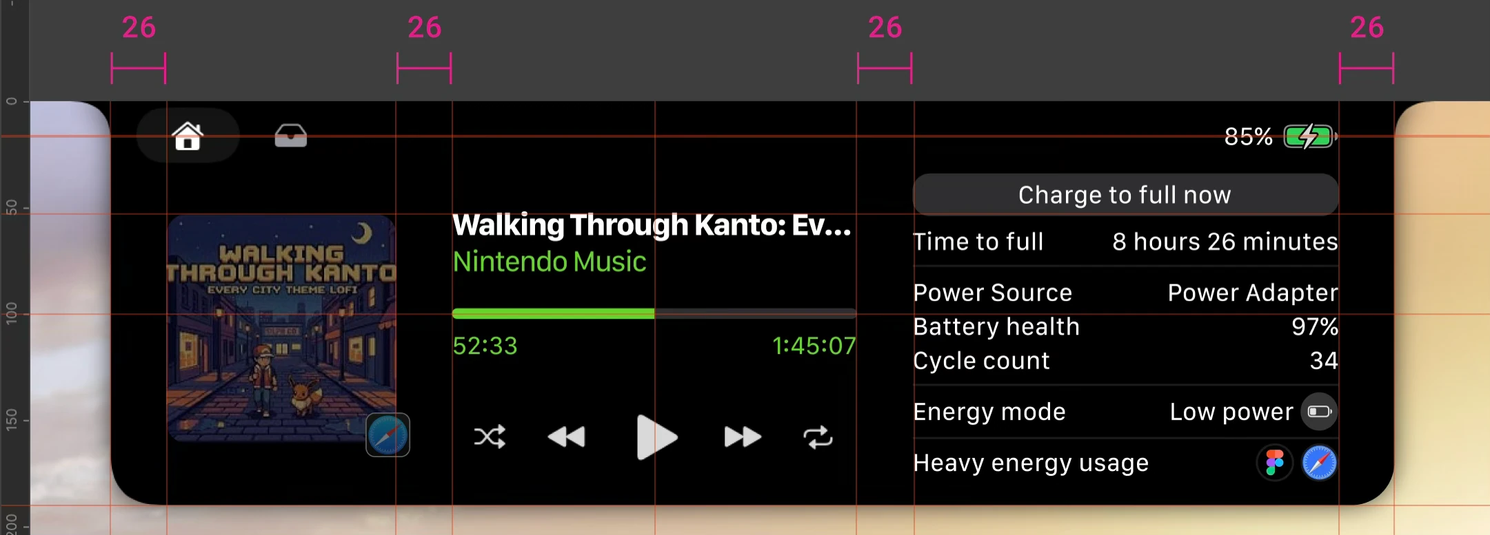
On the media player section, scrubber and timeline scale proportionally. The media control moved to find the center of media wrapper, and if the song title is too long then it will get truncated, applies as well for the channel name (the second title below it). The transition speed is fast (ease out 200ms).
After in animation finished the boring notch now have horizontal padding each 26px.
Out animation
Simply cursor leave from battery information area will close the battery information.
Doing reverse of in.
Assets
Additional color on top of existing color accent.
Additional colors
Charcoal
202021
Clay
2E2E2F

Granny
676767
Tungsten
999999
Sol
FFFFFF
Bali
0091FF
Transparent

Smoke
FFFFFF
21.25%

Phantom
FFFFFF
11%
Typography
Inter is the font, all with vertical trim enabled and letter spacing -0,5%.
Size
Sentence
16
22
32
The quick brown fox jumps over the lazy dog.
The quick brown fox jumps over the lazy dog.
The quick brown fox jumps over the lazy dog.
Weight
Sentence
Extra Light
Medium
The quick brown fox jumps over the lazy dog.
The quick brown fox jumps over the lazy dog.
Components
Button
Charge to full now
Charge to full now
App icon hover


Low power button


Energy mode button
Energy mode
Low power
Energy mode
Low power
Energy mode
Low power
Energy mode
Low power
Energy mode
Low power
Impact
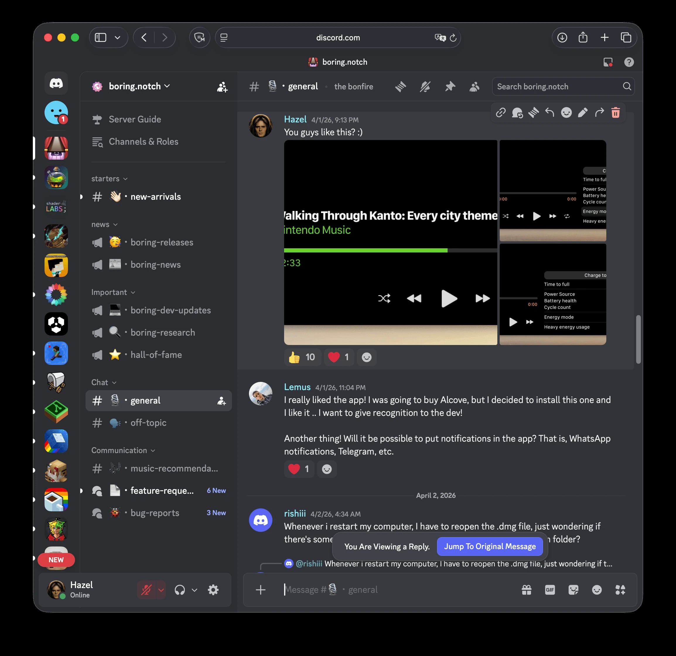
My redesign’s expected impact:
- Less steps to access information.
- More information to get with confined spaces.
- Integrated information to match the whole theme of a notch.
The current status of my prototype has not yet been realized by the developer, even though they are positive about this improvement. When I asked the Boring Notch Discord community, they appreciated my prototype, which makes me happy.
Key takeaway
Honestly this app is supposed to be developed by Apple as an update. However, it’s fun and an honor to design it, with hope that someday Apple would consider Boring Notch design as a reference. Now, what do I learn from designing Boring Notch specifically for battery information access?
Pause and zoom out: When designing User Interface sometimes better idea will comes up in the middle of progress when taking a pause and breath for clarity, then your instinct just tells you to put it in or even start from 0 again.
Alternate reality: Learned that there are more variations with more variables than I thought, that made me learn branching out more on each scenario and connect the dots to another scenario.
A Brief history of app version: Learned that instead of putting all alterations of the prototype in 1 version on the same page, it’s indeed far better to utilize version history from Figma to not just be better at keeping a stepping stone of a version but also for not clashing existing local variables and cluttering style library.
VIEW PROTOTYPE
More projects →




↑