GoTrade

As a daily user of the GoTrade app, my journey into investing in U.S. stocks from Indonesia began with this platform, and on my experience I approached it as if it were a margin account, with mindset of a day trader, even though it wasn't one because of my lack knowledge as a first timer. From day one, I started collecting screenshots of interface to put on “what if” scenario, to then noodling them up for areas of improvement. I discovered plenty of opportunities to enhance the UI/UX design, which motivates me to apply for a position to help develop this platform and create a better user experience.
REDESIGN CONCEPT
JOB APPLICATION PROJECT
MOBILE
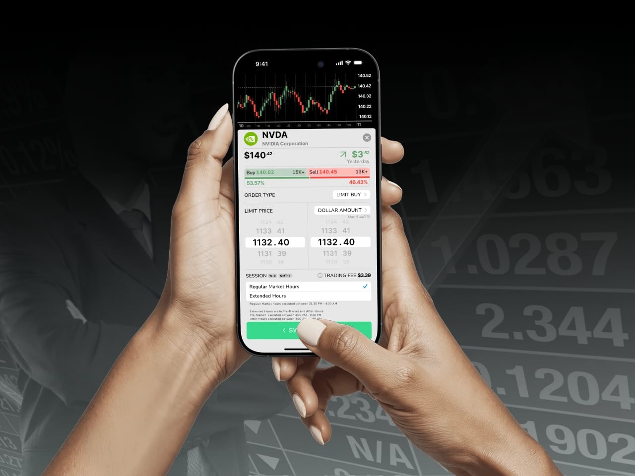
My role
Redesign a concept for UI/UX on few aspect.
Prototyping.
Discovery & Research
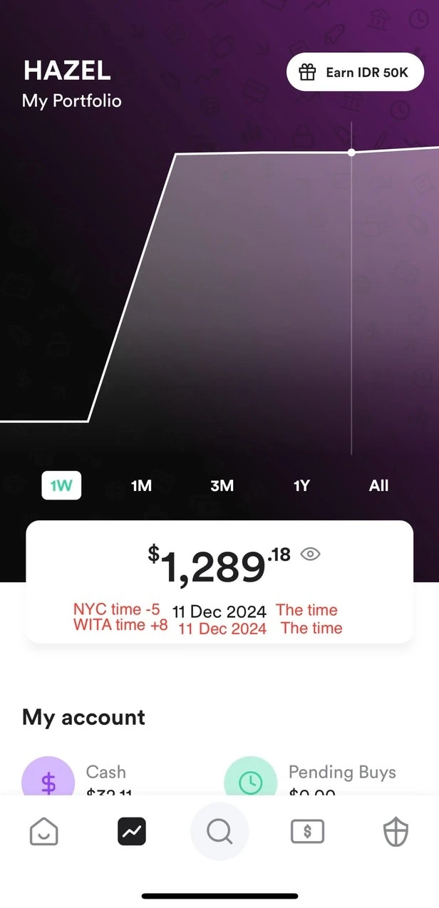
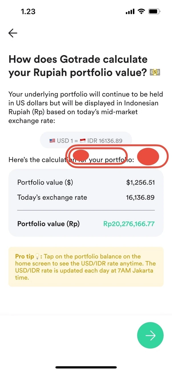
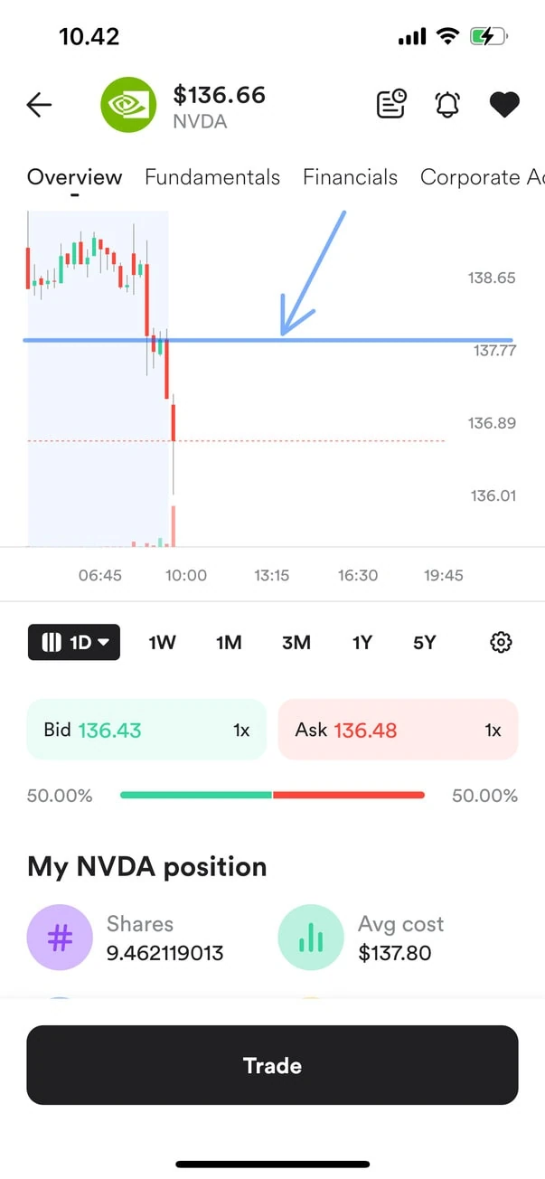
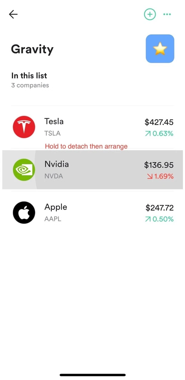
Collecting related bumpies road experience
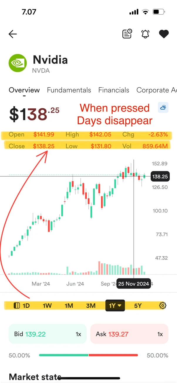
Dynamic day stat on timeline scrubbing
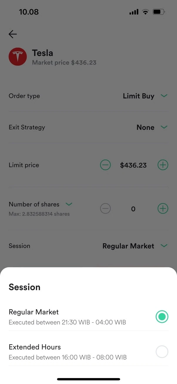
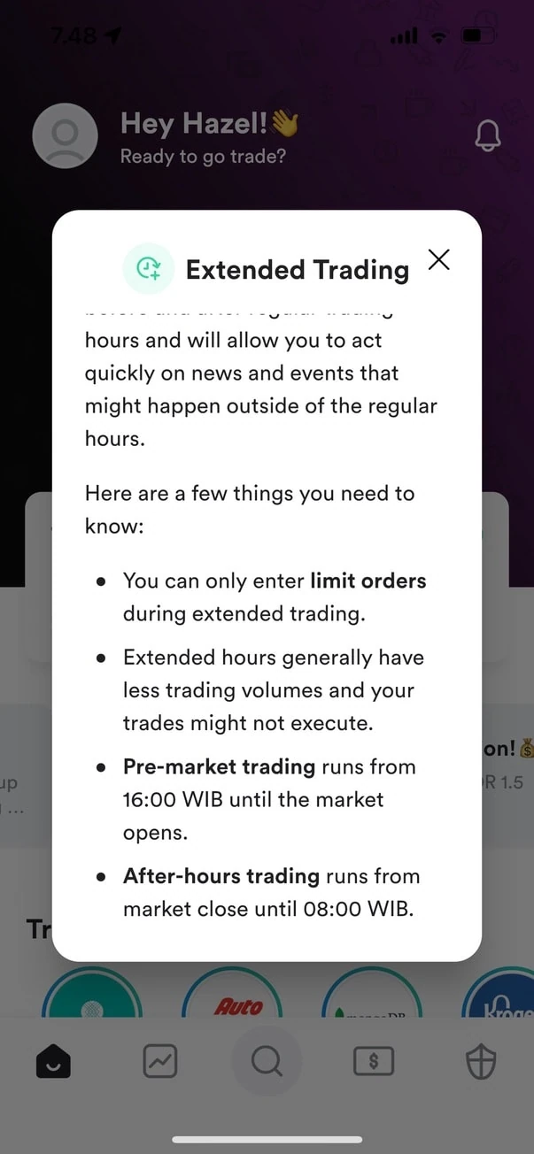
Information on session
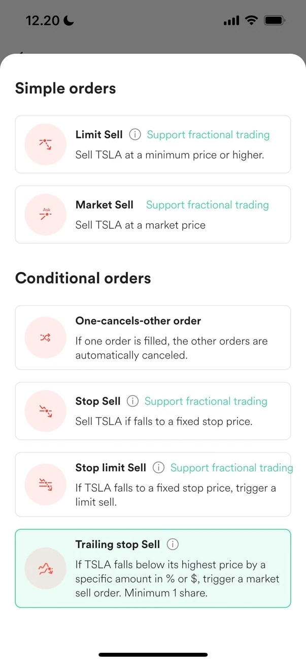
Orders list with their explanation
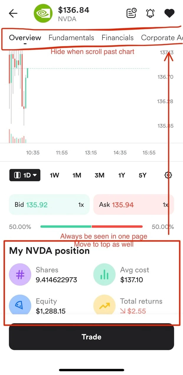
Position on owned stocks at top-navigation
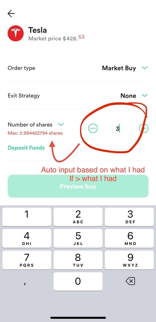
Auto fill for max purchasable quantity when exceeding it’s limit
Auto fill for max purchasable quantity when exceeding it’s limit
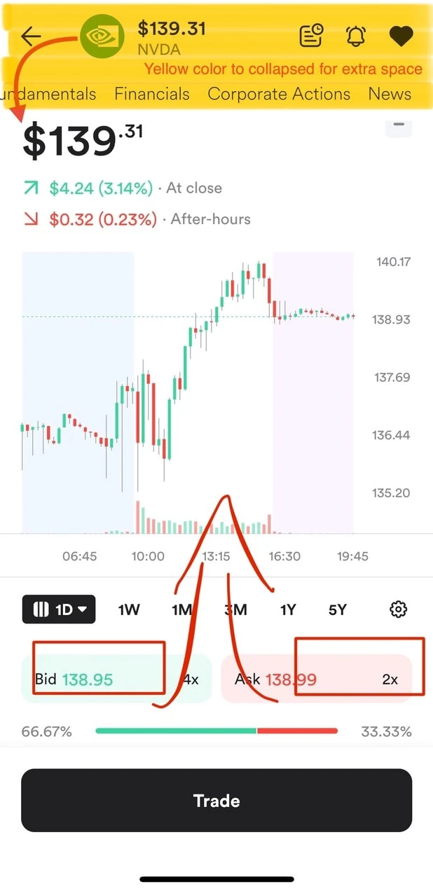
Free space on duplicate content
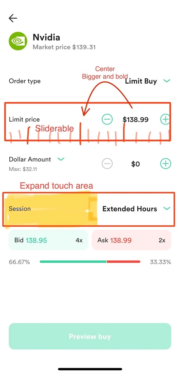
Thoughtful interaction that lead to a better user experience
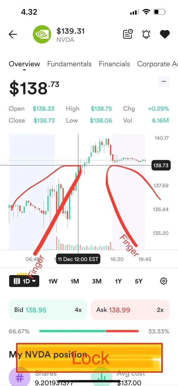
Candle - timeline interaction
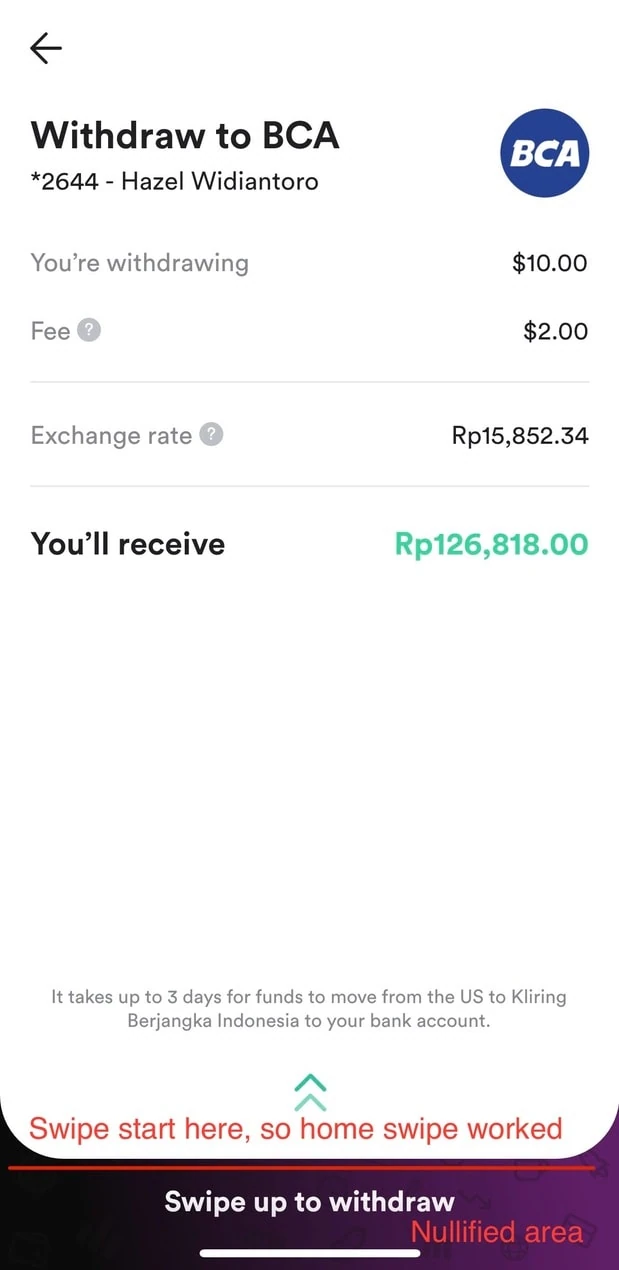
Withdrawal confirmation conflict with swipe up to home
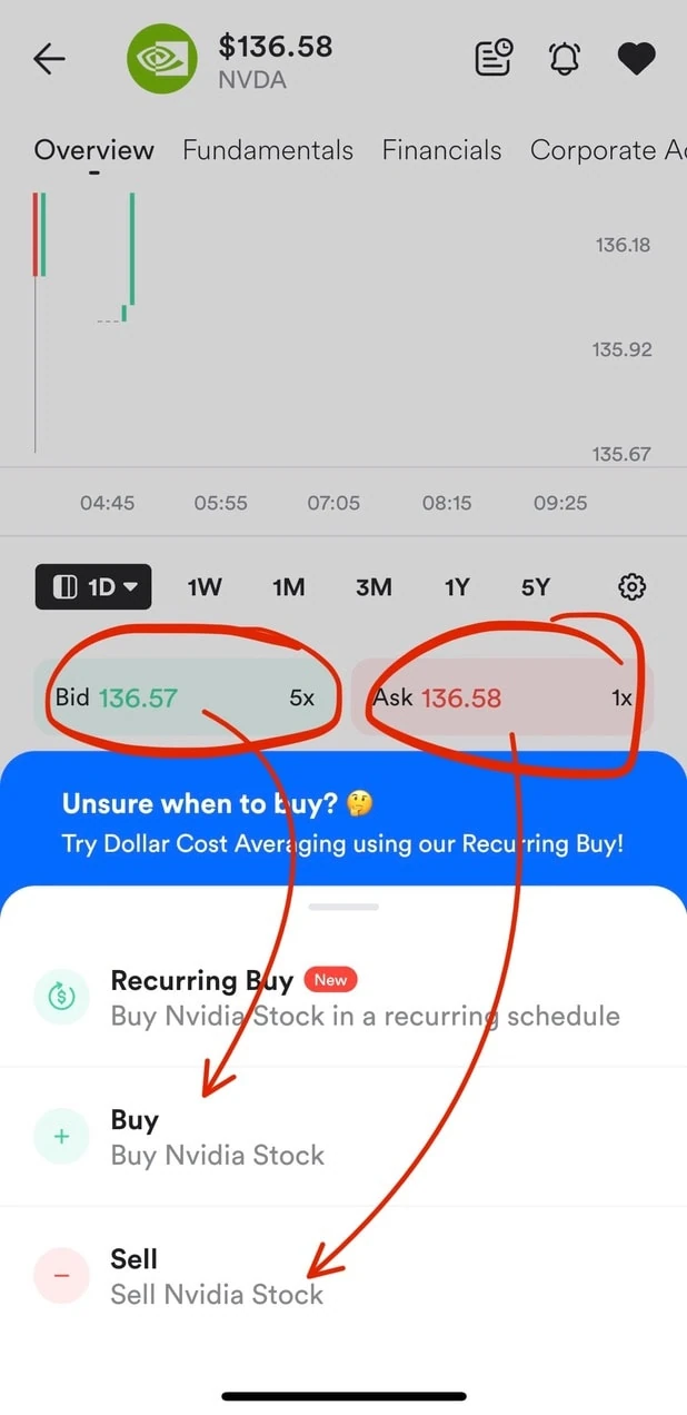
Free space on duplicate content
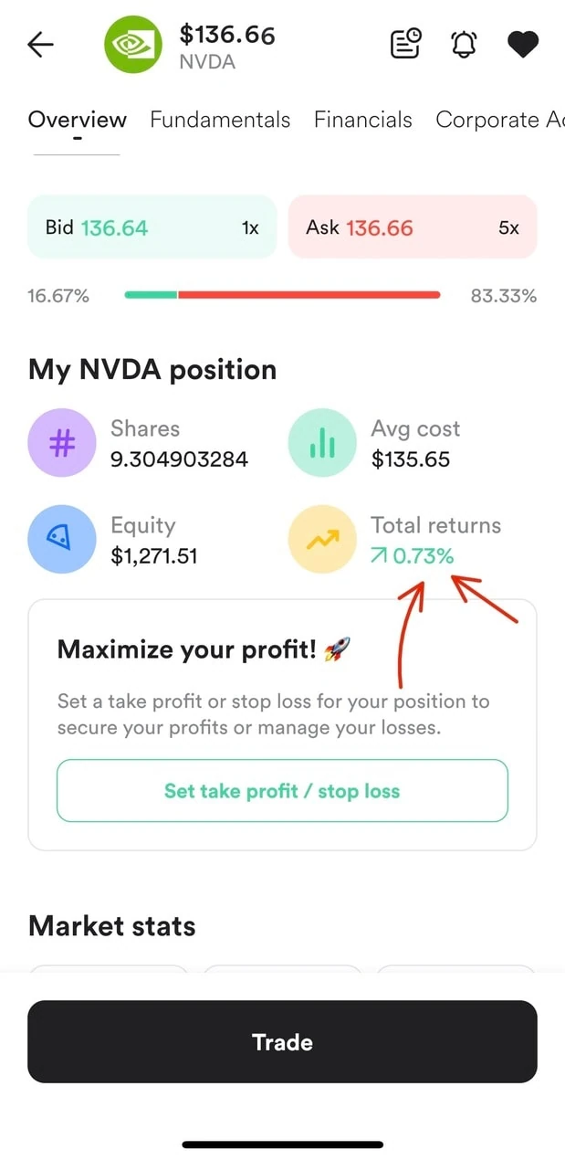
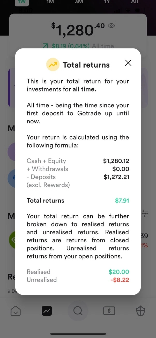
P/L for percentage or fixed
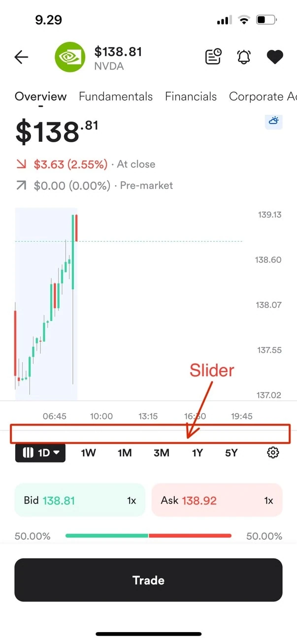
Timeline slider
Collection of other unrelated bumpies road experience
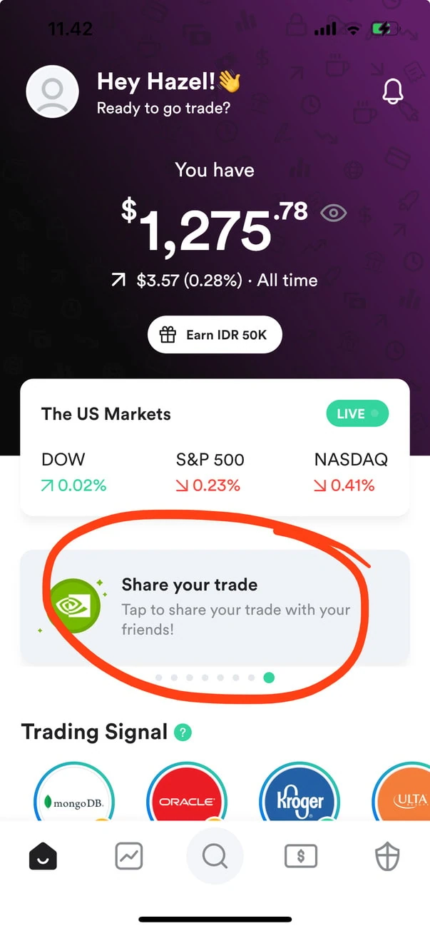
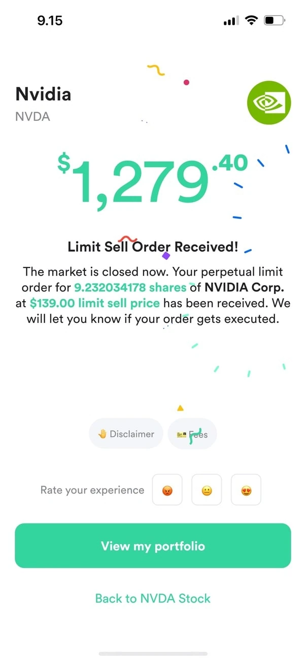
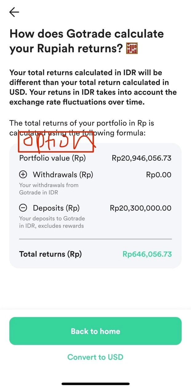
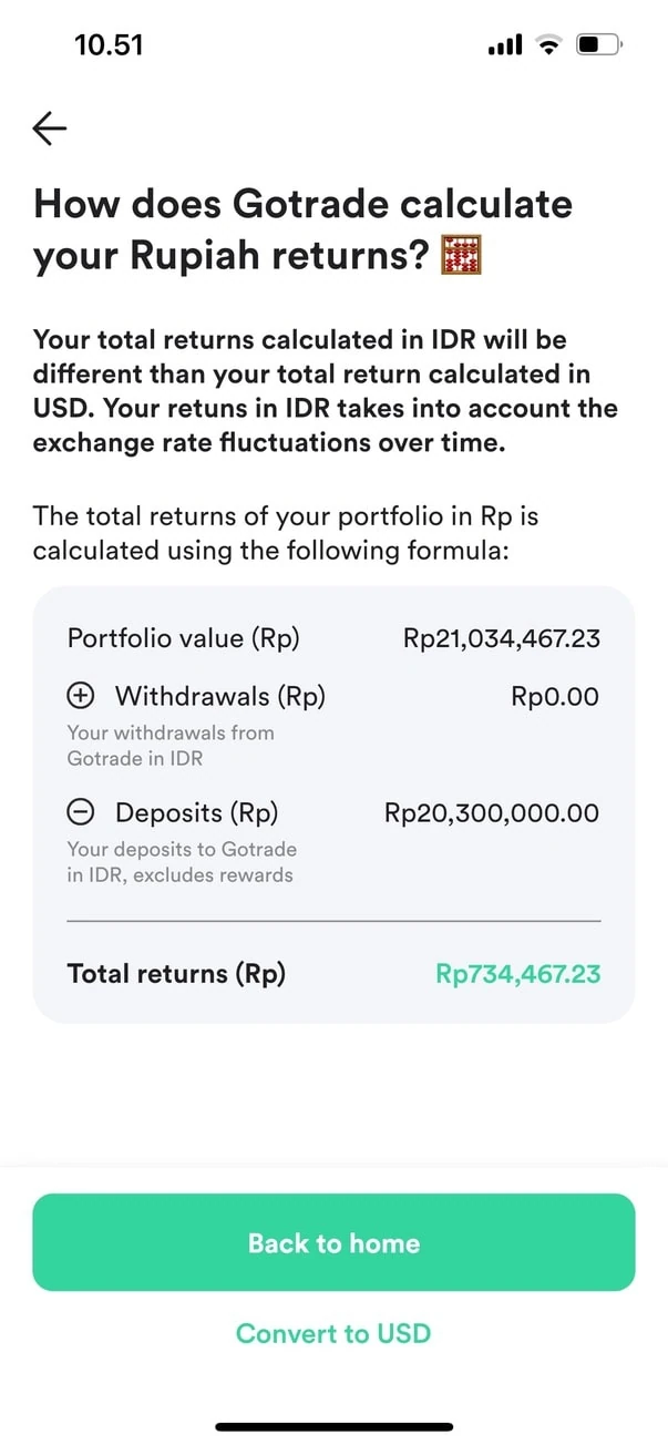
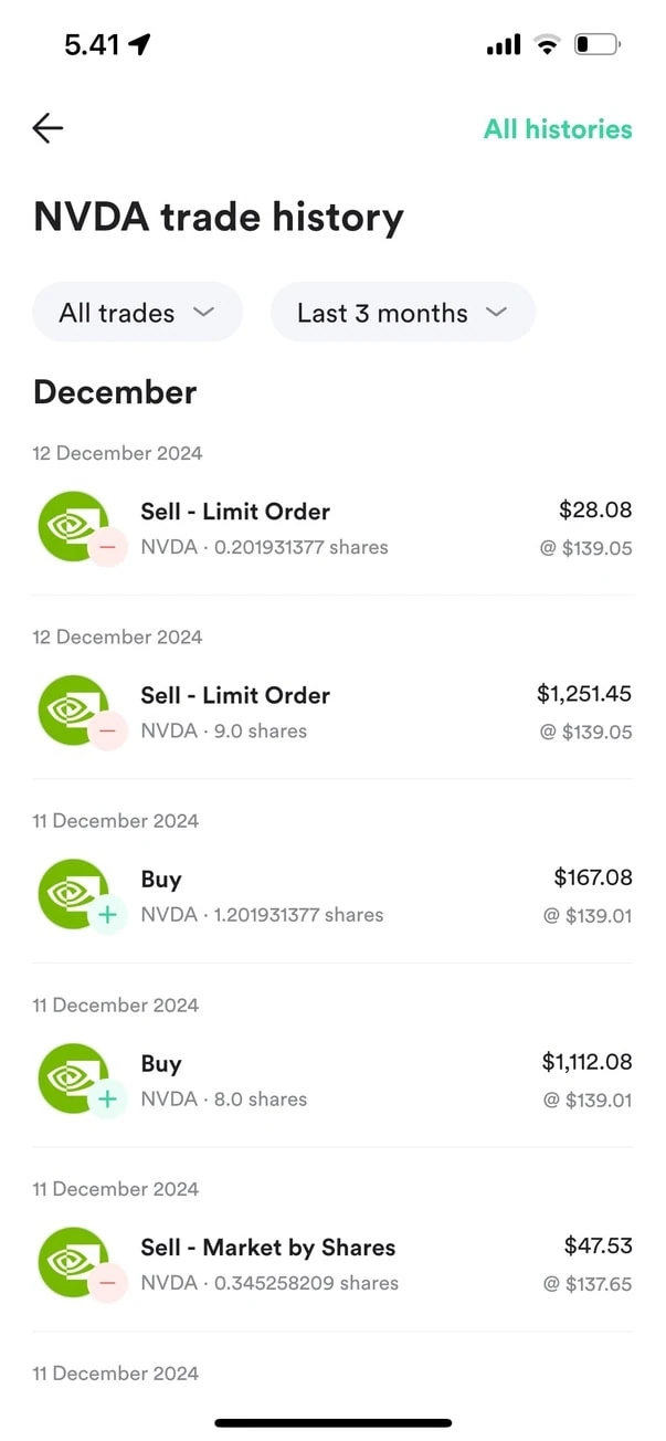
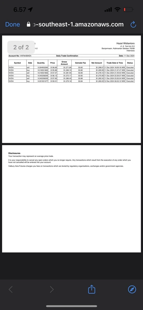
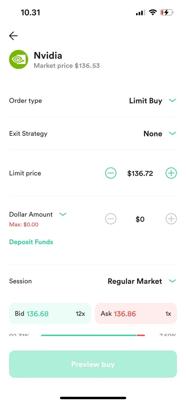
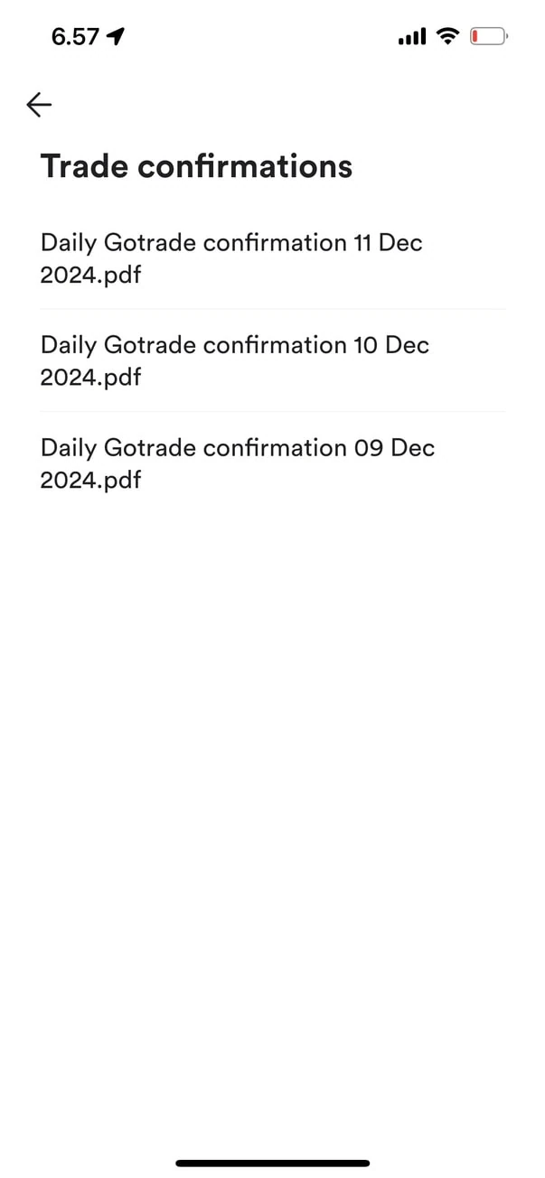
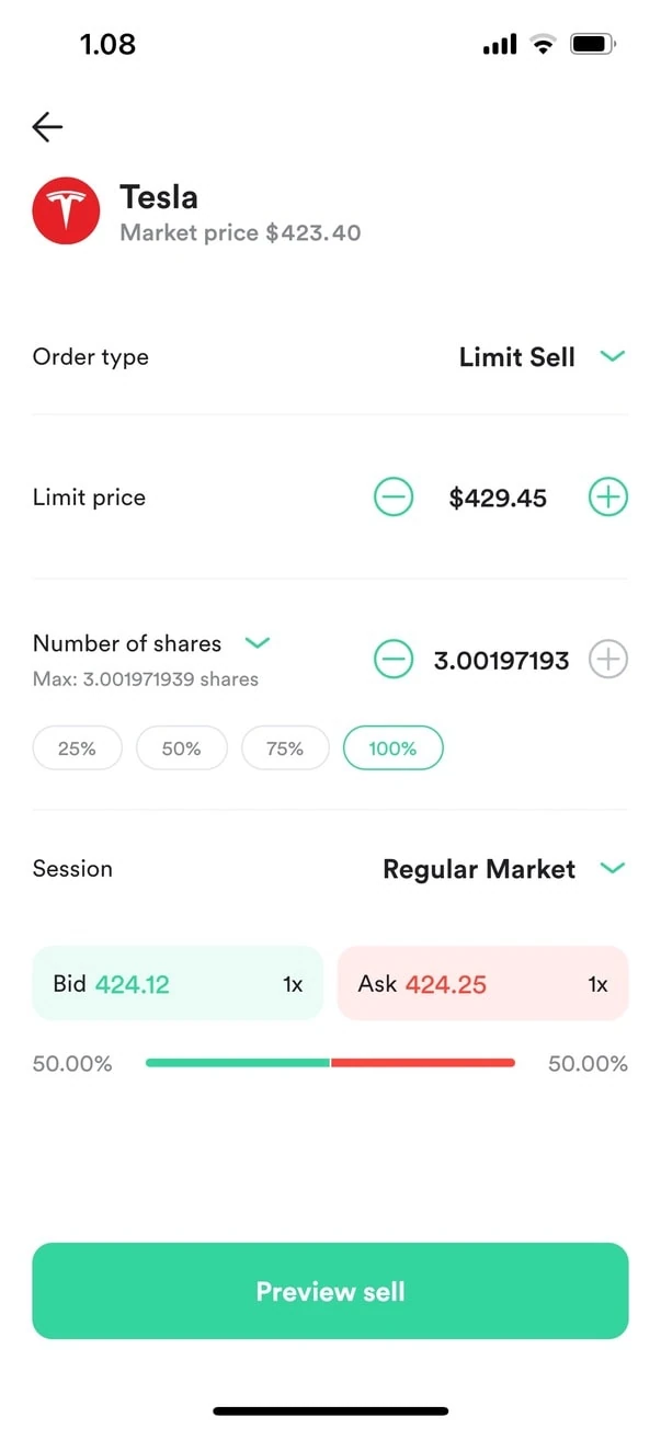
Moodboard reference
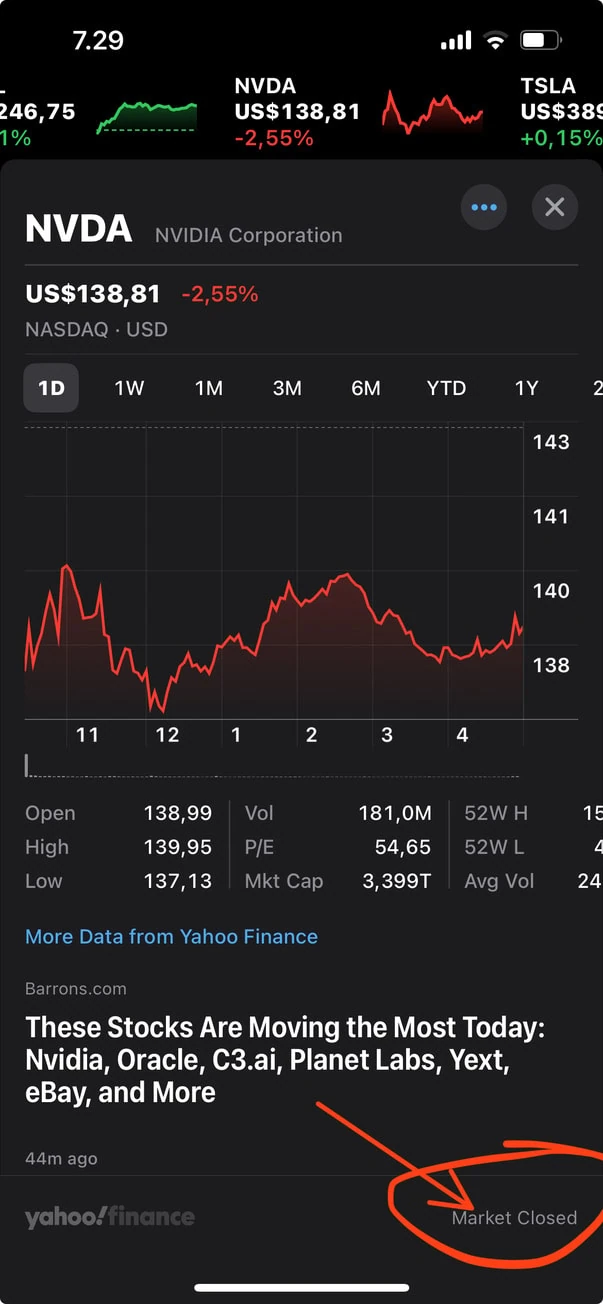
Apple Stocks app
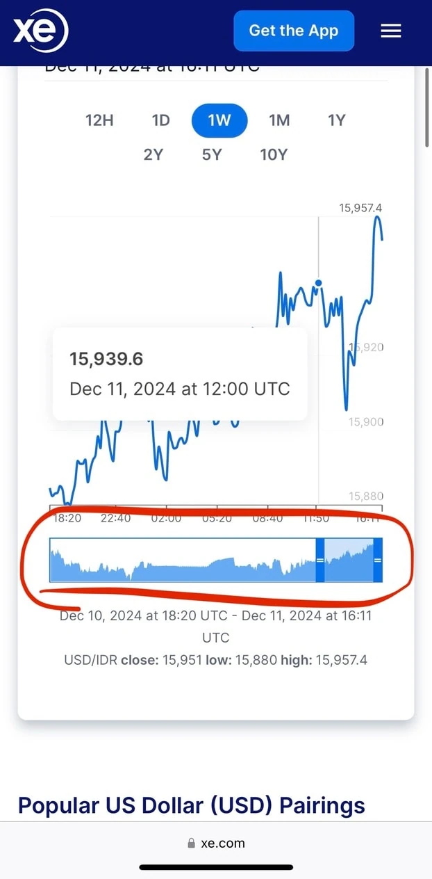
Xe website display on exchange timeframe
Experience utopia
With plenty of screenshot and doodling around help lead me to better imagine what kind of page, content, and interaction to apply in these particular problem:
- Experience on how much portion to buy.
- Selecting the type of shares.
- Selecting types of executions.
- Dynamic info to display on the chart.
- Content rearrangement.
- Input logics.
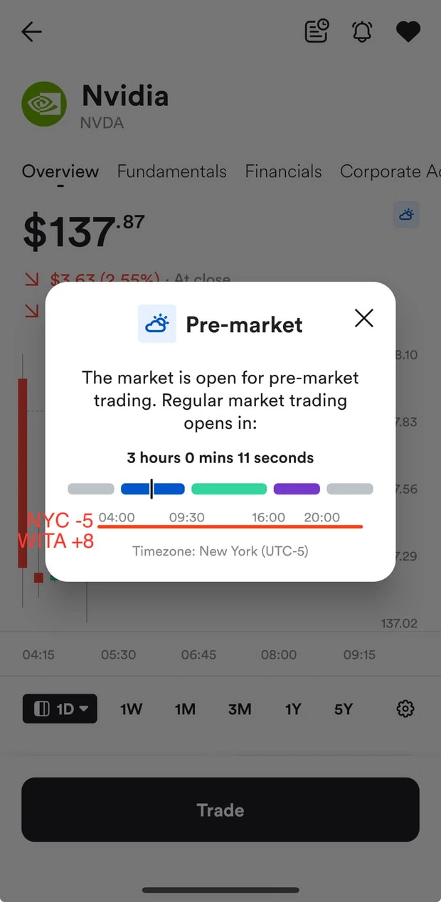
- Align market hours to local hours.
- Rearrange action-trigger to prevent accidental event trigger.
- Multi-point interaction.
- Portfolio P/L unit.
I was nudging around ideas to put here and there, reiterate, until I found the perfect harmony between interface and experience. I’m doing this without drawing low fidelity as this was a one-page scenario.
Assets
Neutral colors
Grey 400
808080
Grey 300
88898D

Grey 200
999898
Grey 100
B3B3B3
Grey
CCCCCC
Red
Red 100
FF4538
Red
FFBCB8
Green
Green 300
60A46C
Green 200
38D98D
Green 100
BED2C1
Green
C6FDE3
Blue
Bali
0088FF
Transparent

Grey transparent
000000
10%
Typography
Inter
Nunito Sans
Size
Sentence
8
8
14
14
14
14
15
The quick brown fox jumps over the lazy dog.
The quick brown fox jumps over the lazy dog.
The quick brown fox jumps over the lazy dog.
The quick brown fox jumps over the lazy dog.
The quick brown fox jumps over the lazy dog.
The quick brown fox jumps over the lazy dog.
The quick brown fox jumps over the lazy dog.
10
12
14
14
15
25
25
The quick brown fox jumps over the lazy dog.
The quick brown fox jumps over the lazy dog.
The quick brown fox jumps over the lazy dog.
The quick brown fox jumps over the lazy dog.
The quick brown fox jumps over the lazy dog.
The quick brown fox jumps over the lazy dog.
The quick brown fox jumps over the lazy dog.
Components
Dollar picker
1129
1130
1131
1132
1133
1134
1135
.
1131
1132
1133
1129
1130
1131
1132
1133
1134
1135
.
1131
1132
1133
1129
1130
1131
1132
1133
1134
1135
.
1131
1132
1133
Cent picker
37
38
39
40
41
42
43
.
39
40
41
37
38
39
40
41
42
43
.
39
40
41
37
38
39
40
41
42
43
.
39
40
41
Order type
Fee info
Buttons
Cancel
Cancel
Total is $1135.8
Confirm? YES
Total is $1135.8
Confirm? YES
Day change

1
%
.74
Yesterday
$3
.62
Yesterday
Highlight
100%
100%
Buy button
Total is $1135.8
Confirm? YES
Cancel

SWIPE TO BUY
Icon


i
Impact
With all the collection of bumpies road above, the problems could be resumed into these:
- Task completion required unnecessary extra steps like pop-ups or directing to another page.
- Interactive elements were under-sized causing conflict to another interactive elements resulting to mis-clicks.
- Duplicated information consumed valuable screen real estate.
Redesign expected impact on projected efficiency:
- Potentially reduced task completion time by 25-50% through streamlined workflows and eliminated redirects.
- Significantly decrease in accidental triggers via better placement interactive elements and larger touch targets with 48px minimum size that meet with WCAG standards to accommodate various hand sizes.
- Reclaimed 15-20% of screen real estate by consolidating duplicate information.
Redesign expected impact on user experience improvements:
- Decreasing cognitive load by simplified decision steps and defined technical terms for newbies.
- Raised user confidence level by being transparent in procedure in execution types and market hour alignment increase decision clarity.
Business potential implications:
- Potentially increased trading frequency due to faster and flawless execution experience.
- Lower the abandonment rates during critical transaction time on peak hour or economic timeline.
- Improved user retention through reduced pain points.
Key takeaway
Conditional logic: I step into more advanced conditional logic in figma by creating state-based interfaces that adapt to user interaction and assign a value to a variable to make my design work dynamically.
Transparency first: Put transparency into every design decision for user trust in financial sector is a crucial part to gravitate around.
First hand: Being both the designer and the long-term user provided more deeper perspective when designing interface and experience, this showing me that FinTech UX requires dual expertise who understand both finance and design, understand the product not just the pixels.
More projects →




↑